Pop art is probably the most well-known artistic movement of the 20th century. Fueled by consumerism, mass media and popular culture, pop art can be easily recognized by its bright colors, defined line works and some kind of iconic element used as the main subject.
So, why does pop art uses such bright colors? Pop Art emerged in the mid-1950’s, and became popular when Great depression and World war II ended. Due to what was happening in that point of time new generation artists wanted something new. Pop art used bright colors highly because of its ability to grab the attention quickly.
The use of bright colors to catch attention is actually a clever move. Therefore is more complex than what looks like. So, we’re going to be reviewing what pop art is, how it started, principal artists and the complex side of the bright colours.
What is Pop Art ?
Pop Art is a movement that emerged in the mid-20th century. It is characterised by simple, everyday imagery, and vibrant block colours. This movement aimed to solidify the idea that art can draw from any source, and that no hierarchy could disrupt this. The bright colour schemes also enabled this form of avant-garde art to emphasise certain elements in contemporary culture.
Pop Art helped to narrow the division between the commercial arts and the fine arts. It was the first Post-Modernist movement (where medium is as important as the message) as well as the first school of art to reflect the power of film and television, from which many of its most famous images acquired their celebrity. Common sources of Pop iconography were; advertisements, consumer product packaging, photos of film-stars, pop-stars and other celebrities, and comic strips. Famous Artists of this movement include, Andy Warhol and Roy Lichtenstein.
History of Pop Art
Pop-Art emerged in both New York and London during the mid-1950s becoming the dominant avant-garde style until the late 1960s. In the United States, pop art was a response by artists. They used impersonal, mundane reality, irony, and parody to “defuse” the personal symbolism and “painterly looseness” of abstract expressionism.
By contrast, the origins of pop art in post-War Britain, while employing irony and parody, were more academic. Britain focused on the paradoxical imagery of American pop culture as powerful, manipulative symbolic devices that were affecting whole patterns of life. Fuelled by American popular culture when viewed from afar, early pop art in Britain was a matter of ideas. Similarly, Pop art was both an extension and a repudiation of Dadaism.While pop art and Dadaism explored some of the same subjects, pop art replaced the destructive, satirical, and anarchic impulses of the Dada movement with a detached affirmation of the artfacts of mass culture.
Bright Colours and Pop Art
Advertisers began using pop art highly because of its ability to grab the attention quickly. It does so because it uses bright and vivid colors. You should take a look at some of the famous pieces of pop-art and you will see the extensive use of bright colors. In total, the ability of pop art to connect with the viewer makes it one of the most powerful media in the modern world. Whether you want to boost customers or master art, you’ll be able to do so with the help of pop art.
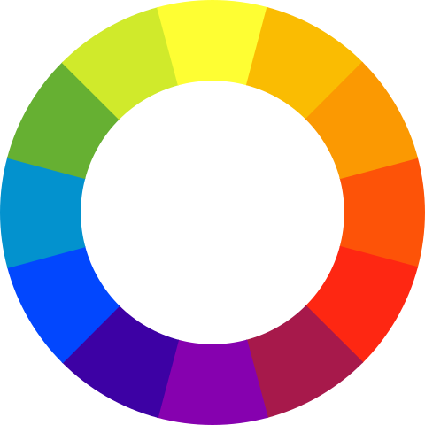
The Color Whell
The Color Wheel is a visual representation of the spectrum of color. It consists of twelve warm and cool hues (Hue is the word used to describe a pure color) and visually describes the relationship between them.
Pop art and color
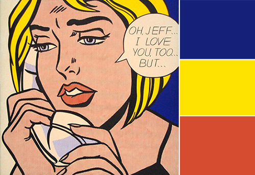
Primary Colors (red, yellow and blue) are the three hues that cannot be mixed or formed by any combination of other colors. All other colors are created from combining these three hues. Those colours are highly present in the works of Roy Lichtenstein, and is due to them that his works stand out so much.
Secondary Colors (green, orange and violet) are the colors that are form by mixing the primary colors. These colors are also highly present in the Pop Art movement as we can see in the image bellow.
What makes pop art stand out?
The main inspirations of pop art are regular items we use in our day-to-day lives. A water bottle, tumbler, mobile phone, anything could be an inspiration for an artist of this genre. The motive is to connect with the viewer on a fundamental level. When a person sees an item he or she uses regularly, he is able to relate with the image quickly.
The context of the image / recognizable imagery:
The context is the most important part of an image. The most attractive feature of these images is the unusual context and object used. This was the chief reason behind the success and huge popularity of this art form. It’s also the reason why it is so popular in the current world. So while creating a piece of pop art, you’d be placing a regular item of daily use in an unconventional place. Some of the most successful artists who performed this task skillfully were Jasper Johns and Andy Warhol.
Combining humor with art:
Irony and satire are two of the most important aspects of this art form. One combines a usual item with an unconventional setting. To display a unique connection, you’ll have to use satire or irony. It will make the artwork more attractive and sensible. Otherwise, it’d be too difficult for the viewer to interpret the artwork properly. Apart from that, as pop art has become popular in advertising, you can see a large number of examples in this field. Advertisers use wit and humor in these artworks to ensure that the viewer admires it considerably and remember the message of the art too.
Using colors that strike attention
Pop art is characterized by vibrant, bright colors. Primary colors red, yellow, and blue were prominent pigments that appeared in many famous works, particularly in Roy Lichtenstein’s body of work.
Innovative techniques
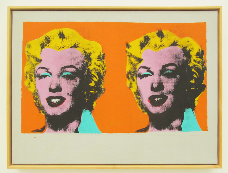
Many Pop artists engaged in printmaking processes, which enabled them to quickly reproduce images in large quantities. Andy Warhol used silkscreen printing, a process through which ink is transferred onto paper or canvas through a mesh screen with a stencil. Roy Lichtenstein used lithography, or printing from a metal plate or stone, to achieve his signature visual style. Pop artists often took imagery from other areas of mainstream culture and incorporated it into their artworks, either altered or in its original form. This type of Appropriation art often worked hand in hand with repetition to break down the separation between high art and low art, which made the distinction between advertising and media from fine art.
Mixed media and collage
Pop artists often blended materials and utilized a variety of different types of media. Like Robert Rauschenberg, whose works anticipated the Pop art movement, artists Tom Wesselmann and Richard Hamilton combined seemingly disparate images into a single canvas to create a thoroughly modern form of narrative.
Conclusion:
- Pop Art emerged in the mid-1950’s, and became popular when Great depression and World war II ended;
- Pop art used bright colors highly because of its ability to grab the attention quickly;
- The bright colour schemes also enabled this form of avant-garde art to emphasise certain elements in contemporary culture;
- Advertisers began using pop art highly because of its ability to grab the attention quickly;
- Primary Colors are highly present in the works of Roy Lichtenstein;